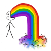
Green Infection-I Love Green
i have changed the color of this ad from sharp to apple color, try to make it warm & comfortable, because the message is telling to the public the gobal warming getting more & more serious, & we got to support & recycle in order to protect our home, so, i used the love gesture to present the support of recycling, its kinda "infection".

Art Infection- State of Art
The eye is the main element in this ad. It is because the message is telling that the art opens our eyes to see & our brain to imagine. Art is abstract, so what i represent it is flying ship, from the picture it showing it brings us to see the wonderful thing in the world. I use contact lens as its product.

Love Infection-Love song
I changed the title type, try to make it better & lively. The elements in the picture are romantic, such as cupid, hot air balloon, rose, Eiffel tower...etc. It contains 3 love, family, animal & couple love, they are song which in the black cd, so i try to make it vintage to fit with it. I used Hershey as the product, its warm & sweet.


 Like what i mention in last post, art brings us to see the world, so i put this ad on the building, try to make it the city more attrative.
 Here is Mark's square, the central square of Venice, it is a romantic location in Italy. Try to use this ad to 'infect' the public & tell them to care each other.